Carlyn Mae Quejado
BA Hons Product Design Graduate

EsSense
A set of 3 items that curate your essence of home,
no matter where you take them
Reflection
This Project ‘EsSense’ was informed by my CP3 report ‘Creating a Home, when your Home is Undefined’. My proposal at the end of that report was to create a set of sensory tools to evoke the feelings of home and hygge. I pulled the data I previously gathered on the top 3 feelings people associated with home and which rooms people felt most at home in. I used these to delegate a sense to each room.
I made a mind map of possible homeware products I could do, associated with each sense, and went on from there. I decided on an Edible Mist Diffuser, Magnetic Sensory Zen Garden and Mood Setting Bluetooth Speaker. I tried to reach out to the ‘Lick Me I’m Delicious’ asking about how their edible mist worked, however they did not reply. From my research I inferred that they just use food grade essential oils in the water. I used WGSN to see Interiors Colour Forecasts, it’s a very useful tool for insights and enabled me to curate my own colour palettes.

When I began my drawings they were really small as they were on the mind map, however in the future I would make sure to do my drawings bigger and instead of just doing small messy sketches. It started off well, however when I kept iterating the same design it started getting a bit messier. I think it was difficult to draw my products, as they were organic forms, and the curvature is difficult to replicate, especially proportionally drawing ellipses at an angle without them looking like circles. As this was the case I did a lot of CAD iterations of the design, as it enabled me to accurately draw the curves I wanted and I was able to test out hole shapes and easily move the placement. CAD also let me see how the 3 objects fit on top of each other and the feasibility. For example, I realised I couldn’t have a spherical based diffuser with the hole fit around it, because it just wouldn’t come out.


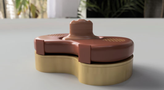
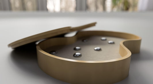
After developing an array of designs of both the speaker form and diffuser form, I found choosing the form quite difficult. However knowing that the bottom couldn’t be convex narrowed down my options. Originally I wanted to have the hole off centre, however through my iterations I saw that it wasn’t aesthetically pleasing so went with a centred hole in the shape of an angled ellipse. In my initial iterations, I had the diffuser sit through both the zen garden and speaker. This didn’t seem efficient for my zen garden and decreased the surface area, so I made the diffuser sit on top of the box, only going through the speaker. This allowed me to only have to focus on one hole design and cut out having to figure out having a lid with a hole in it. It simplified my design and the zen garden was more effective in communicating an organic shape. The additional surface area also allows for designs to be raked through the sand. Designing 3 objects simultaneously taught me that form choice can be informed by the surrounding objects, and in this project the diffuser was the primary form, with the speaker as the secondary, both informing the shape of the zen garden box.

As soon as I knew the objects were to be designed to fit together, I began model making. I started off in cardboard just to visualise how they’d fit and sit together in real life. Cardboard wasn’t very effective to make organic shapes but it did the job of being a physical visual model, which could be taken apart and put together. This model reiterated to me that the zen garden needed more surface area as the hole reduced the space too much. The boxy shape showed me that I definitely wanted soft curves in my design, void of harsh edges. For the diffuser it was difficult to model the shape I wanted at home, so I used the 3D printer to iterate models. This was good as I previously had no experience using 3D printers, I learnt that when printing I need to angle the body in a way that would require minimal supports and that tolerances are very important when fitting bodies together nicely. I went from not adding tolerances at all to ±0.7mm. This was too loose for my liking, so I redesigned the object to have ±0.4mm for my final print which was a lot better in my opinion as it fit together easy but didn’t come apart as easily. I also learnt 3D printers are not very forgiving, so they need to be watched every now and then in case there’s a mishap with the filament, otherwise you may end up waiting a lot of material that hasn’t stuck properly over a long period of time.
Once my 3D printed diffuser came to life, I was then able to focus better on the other products, as they are heavily informed by that shape. Throughout the process of using CAD I moved bodies between files to inform my shape. Once I had decided on the organic shape I liked for the zen garden and speaker I was able to use that CAD drawing as a reference for the shapes. This was very helpful in terms of accuracy and uniformity. As I was only making models for this project and had decided to only 3D print the diffuser, I needed a way to replicate this shape when cutting wood for the zen garden and creating my foam model. I printed this drawing on card to create a parent template for my work. I also printed another with a 5mm offset, however the technicians informed me this wall thickness may not be sturdy enough when using the machines, so I doubled it to have a 10mm wall thickness. I also had extra templates with the hole cut out and without. As you can see this drawing only has a hole for the diffuser to sit in and not for the speaker’s feet. This was a development I added quite late in the project, so was not able to feature it in the real-life model as it had already been made and I had no time to remake it. I chose to add this feature as the lid for the zen garden is only useful during packaging and transportation, when it is in your home there is no purpose so I thought it would be good to use as the speaker stand to create more stability and could additionally
be used as a decorative storage plate in the bedroom with it.
For the speaker model I chose to only model it in foam, as it was quite ambition for me to create 3 products in the space of this 1 project. I knew from the start not all the products would be functional, but I wanted to at least be able to communicate the form together with the rest of the products.

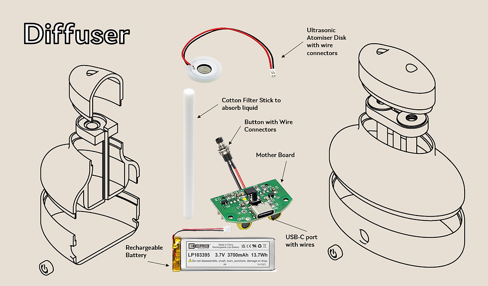
When exploring the electronics side of both the diffuser and speaker I was able to delve deeper into the functionality. I am well versed in how these products would work, even though the models are not necessarily functional. For the diffuser I ordered an atomising circuit online just to see how it works and what it’s connected too. This was very informative and I was able to visualise properly how it functioned and where the components of the circuit needed to fit into the product, this allowed me to develop the design from a technical perspective. This specific circuit had to be plugged in to have a power source, but I decided with mine I would just have a rechargeable battery inside.
As for the speaker, I had an old speaker that was past its prime, so I just took it apart and was able to make a list of components that needed to fit inside the speaker vessel. Other than the flat mother board, various buttons and ports the main thing I knew I had to have space for was the rechargeable batter pack and the speaker cones. I never usually explore electronics this much in my projects, I quite enjoyed it, as it gives a lot of realism to the product.


Rendering was particularly important for my products. Since the models aren’t functional and may not be in the colours or materials I wanted, the renders had to convey this. I had an extensive amount of CAD drawings and at this point in the project I was very familiar with Fusion 360. I did attempt to use Keyshot for my rendering, however I found that the rendering of my product looked a lot better in Fusion360, which was surprising, but easier for me as I am more capable in this program. As I have 3 different products, the rendering was quite time consuming, as I had to render visuals or both the products separately and together. I was able to convey the colourways too through rendering. My visuals turned out a lot better than I expected them to and I am very proud of myself. I did however have some trouble when it came to the visual of the set all fitted together as the products weren’t moving where I wanted them to. I also had to change the colourway for this one as the oat colour was starting to look quite phallic. I used the Oat colourway for the her image though, as majority of the feedback I received had a preference to that, as it was neutral and would be more universal.
Overall, I am proud of this project. I had some trouble getting back into the student mindset throughout this year, coming back from a year out. I put a lot of time and effort into EsSense and although I think the project can be developed more, I think it does have potential to be capitalised from. After this project I will continue working on it on the side and I would like to 3D print the diffuser again and hopefully the speaker. I would like to improve more on the speaker model given the time. I also had an issue at print city as they didn’t have the colours I wanted, so I may potentially see if I can source a filament to my liking. In this project I think my CAD has improved a lot, as well as my rendering work. My research work was improved during my CP3 and I was able to use credible sources that actually informed my project greatly.


